
A Decent Dose of Wonky
An Architectural Walk with Kathy Wallace, Barangaroo August 2026
With my family away for a week, I set off again with the wonderful Kathy Wallace on another architecture walk — this time around Barangaroo.
Kathy has a wonderful ability to look at a building or a scene and immediately see the architectural composition within it. She also seems to know all the secret — and not so secret — places to stand to get the shot.
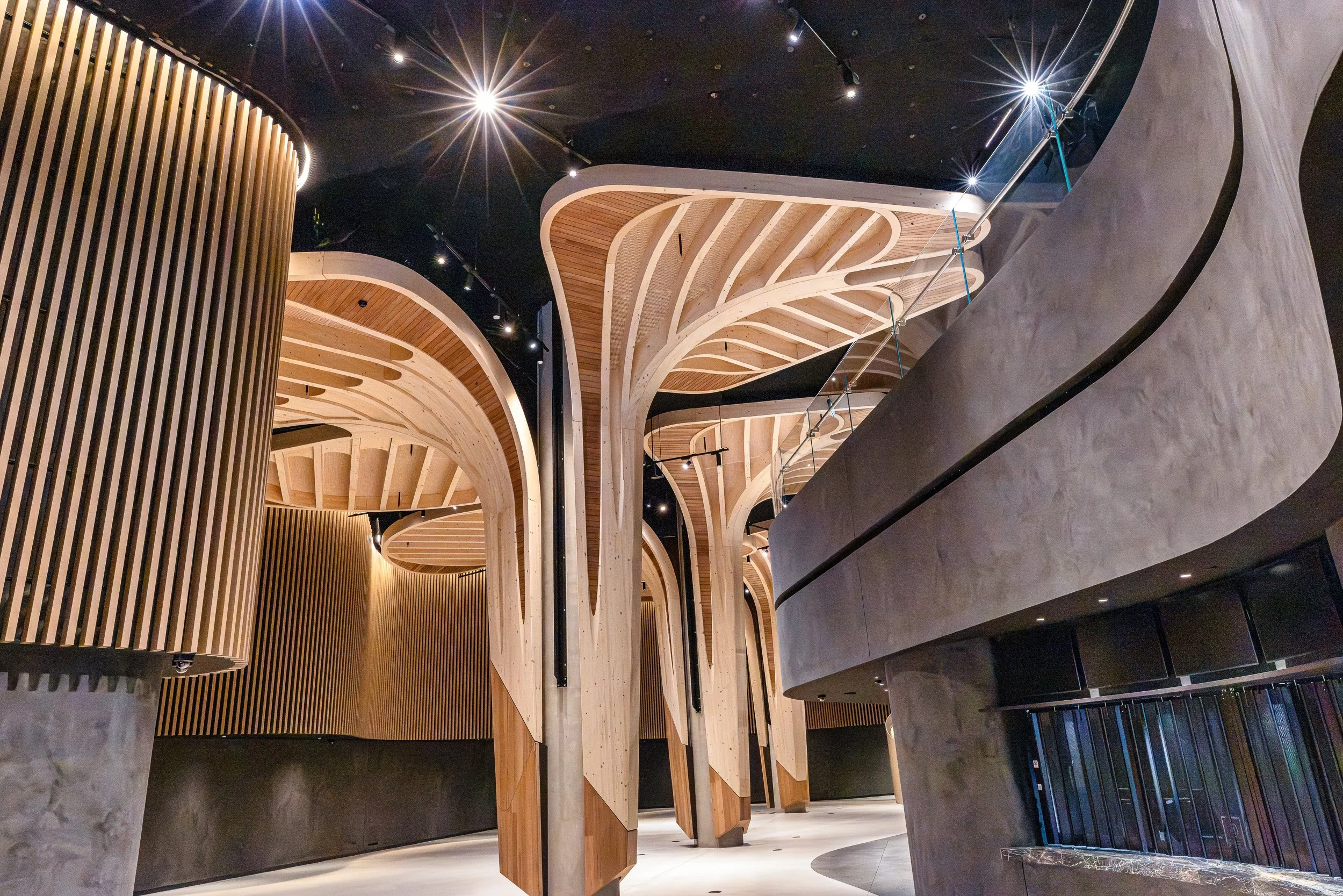
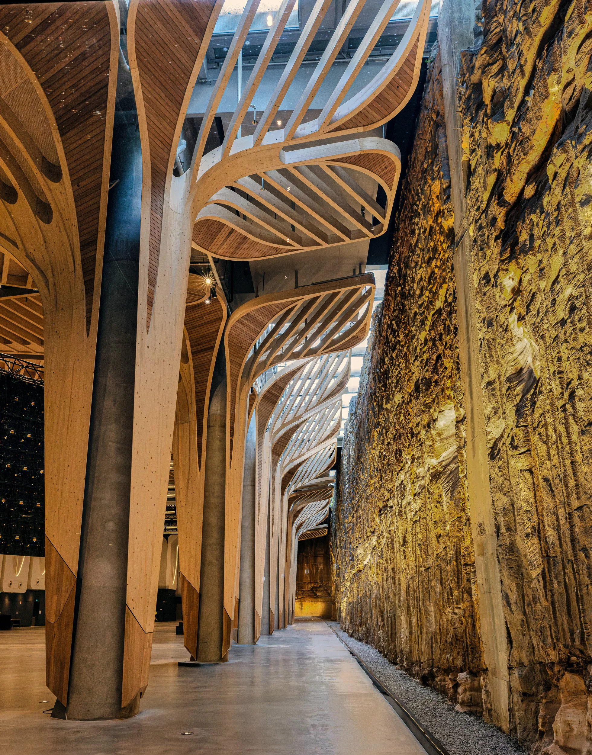
The walk began with a visit to a building with the most incredible architecture, both inside and out. Wooden structures resembling abstract trees rose through the interior, their pale timber ribs contrasting beautifully with darker panelled wood and wonderfully flowing forms. Sweeping curves, slatted timber expanses and a restrained palette of light timber and warm chocolate brown gave the whole space a striking sense of harmony.
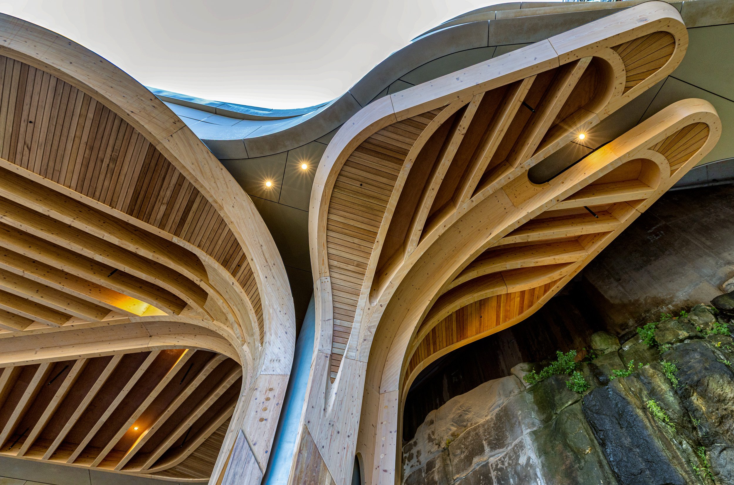
The exterior was every bit as beautiful, with timber ribs bending, twisting and flowing into gorgeous organic curves.
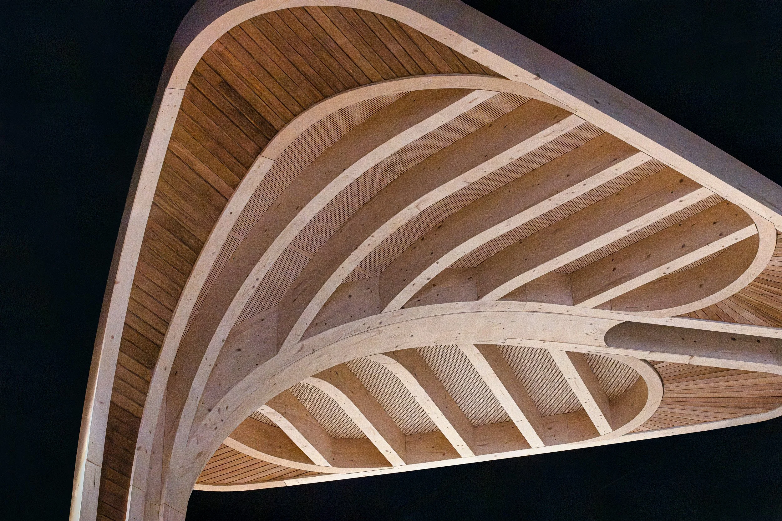
It was here that I came to the realisation that, when it comes to architecture, I really like wonky. Somehow, it feels fun, slightly unexpected and full of movement. Although this architecture is stylish and sophisticated, it also has a decent slurp of wonky — and I love it.
And then there is that incredibly textured rock wall below. How divine is that?
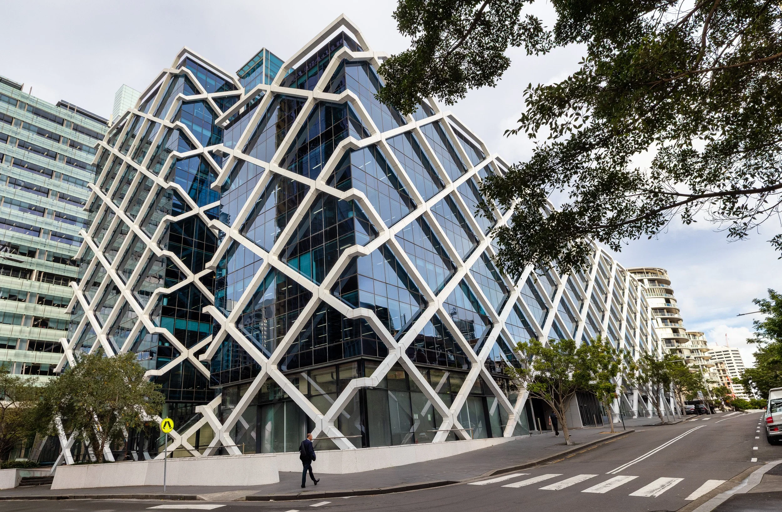
Below is another delightfully wonky building with a group of enormous sculptural pots outside, each decorated with bold red markings. I found myself instinctively trying to tone down the red because Lightroom’s highlight warning is red, and apparently I have now been trained to regard patches of red with suspicion. They still disturb me every time I look at the photo.
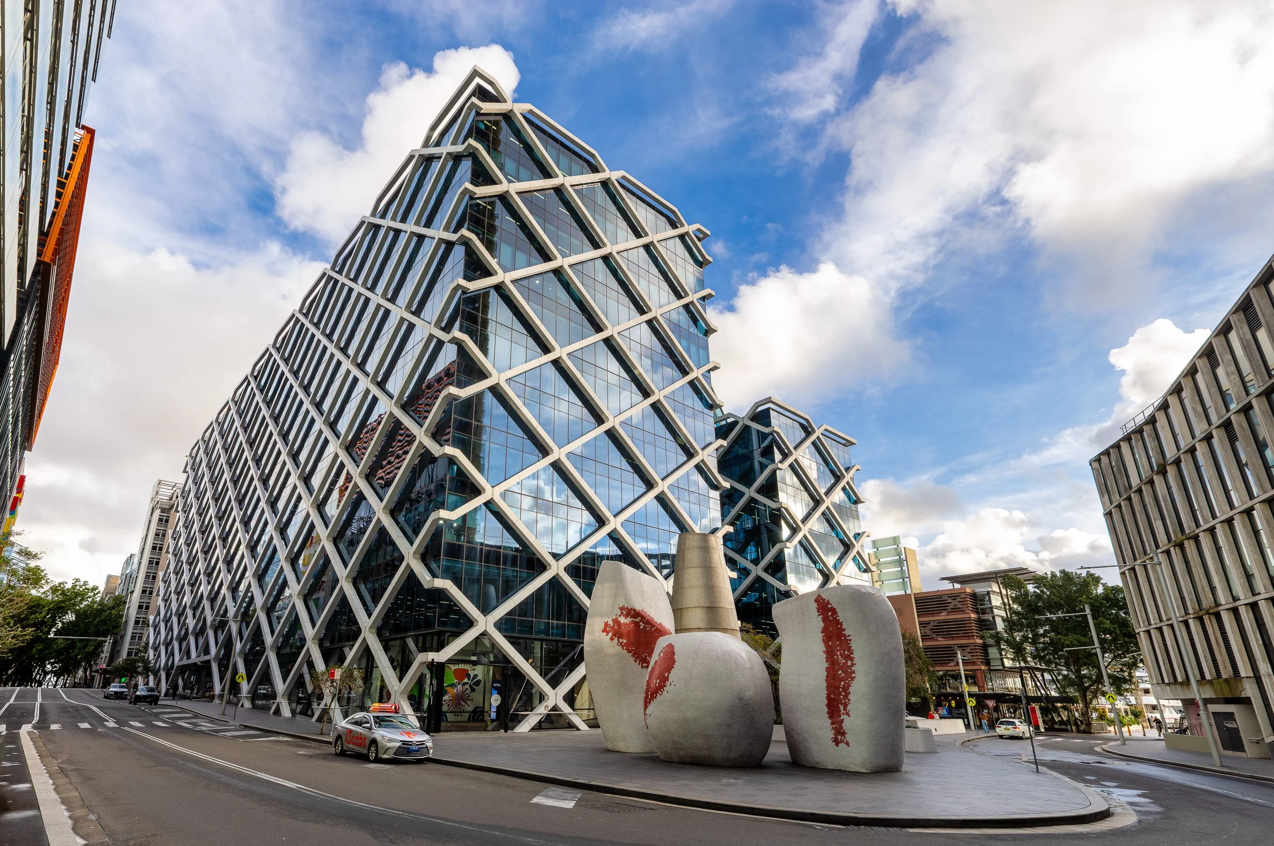
I love the perspective in this shot. The distortion from the wide-angle lens only seems to exaggerate the building’s wonkiness, and in this case I think that makes the image better. Everything leans, stretches and pushes through the frame, giving the photograph a wonderful sense of movement and funk.
Looking down streets can be great fun too, particularly when you start playing with angles and distortion. I really liked this view, helped enormously by the colourful and rather playful buildings lining the street. Amazingly, the building on the left is actually the wonky one, yet the lens distortion has somehow made many of its irregular shapes appear almost rectangular. You never quite know what surprises a wide-angle lens has in store for you.
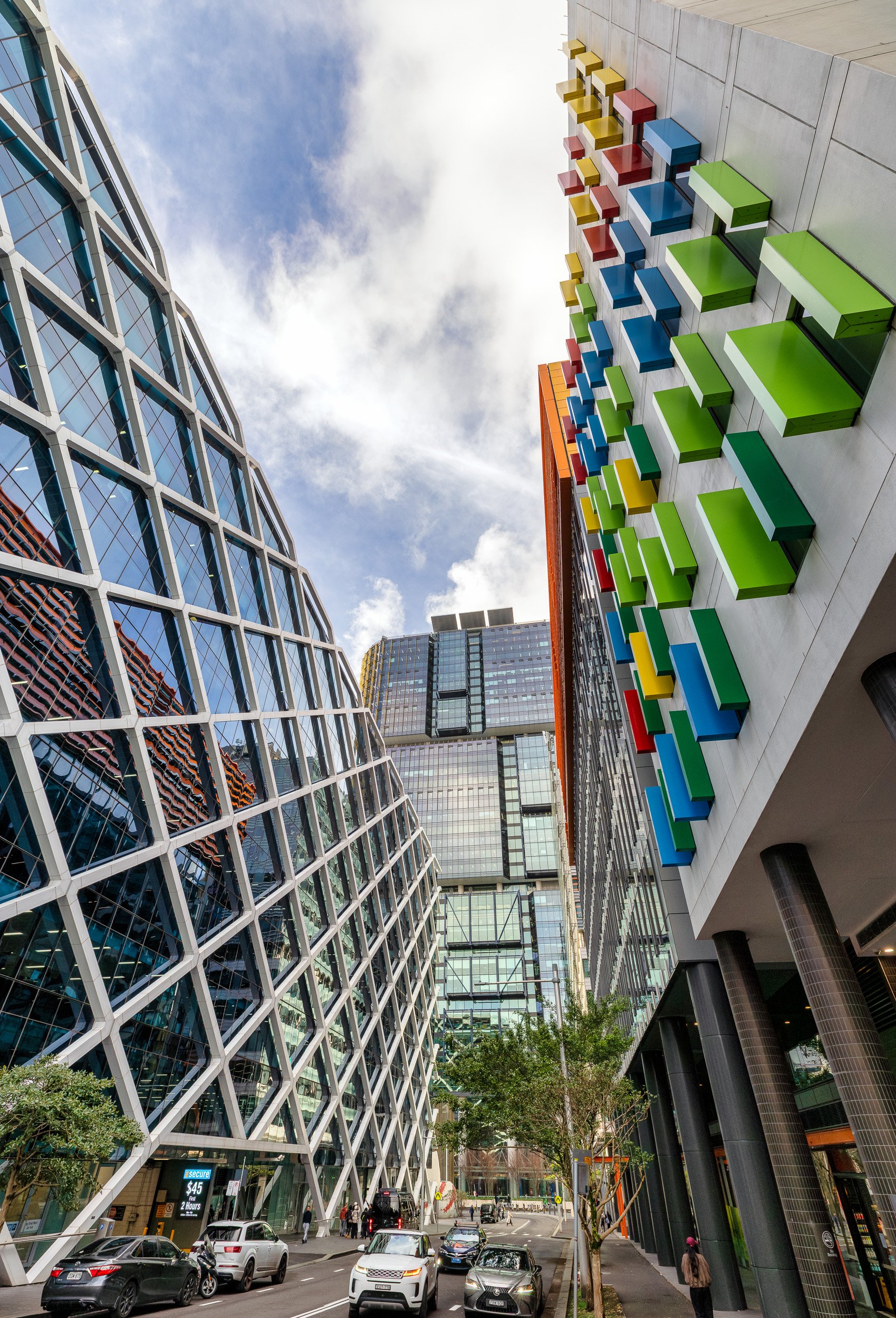
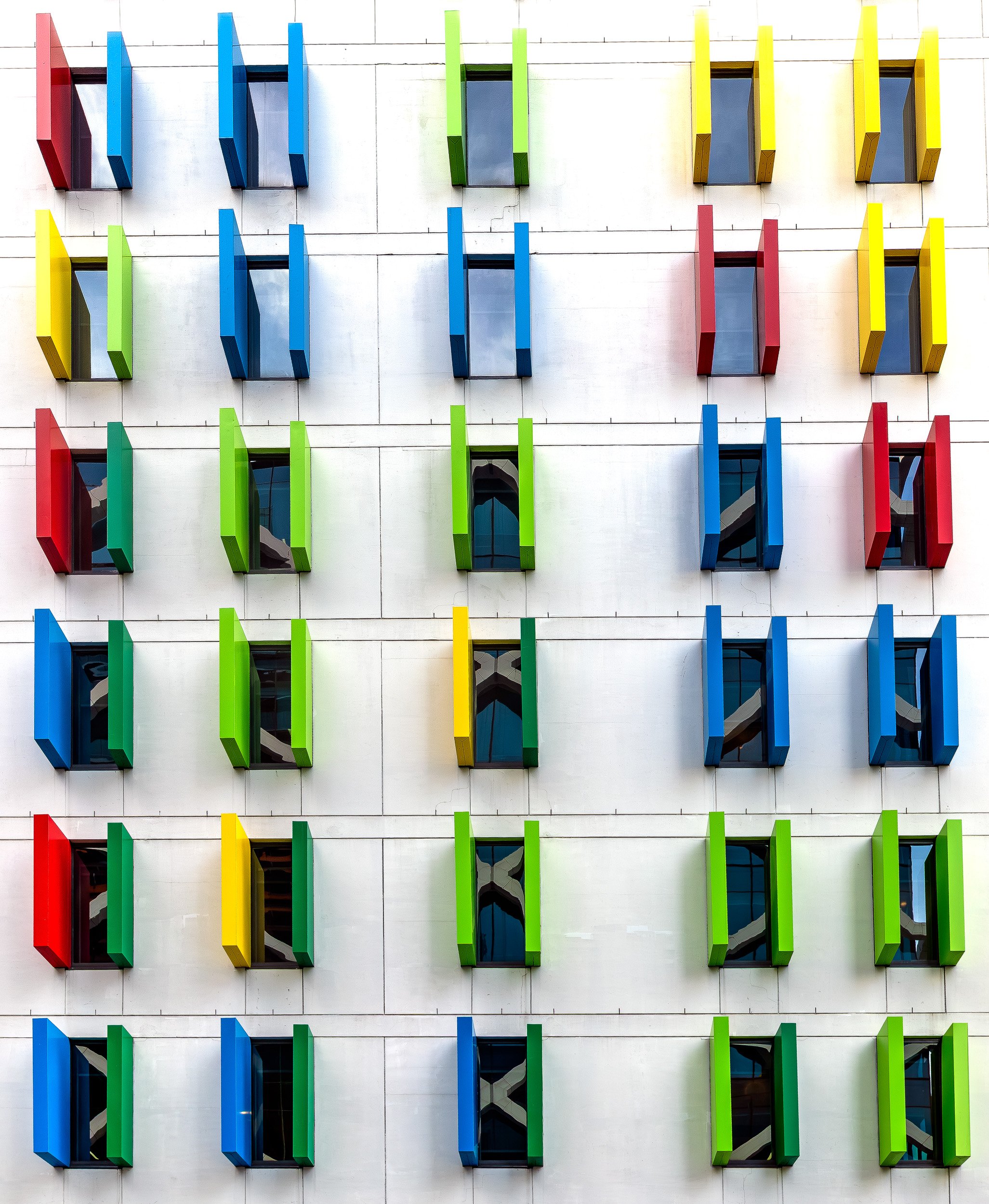
Colour is always my friend, and just look at this nearby building. The repeated graphic pattern of reds, yellows, blues and greens, combined with the vertical window shades, made the whole façade feel cheerful, playful and full of energy.
Although I do think Ibis might need to give the building a bit of a clean — I had to do rather more post-processing than expected to make those white walls look white again!
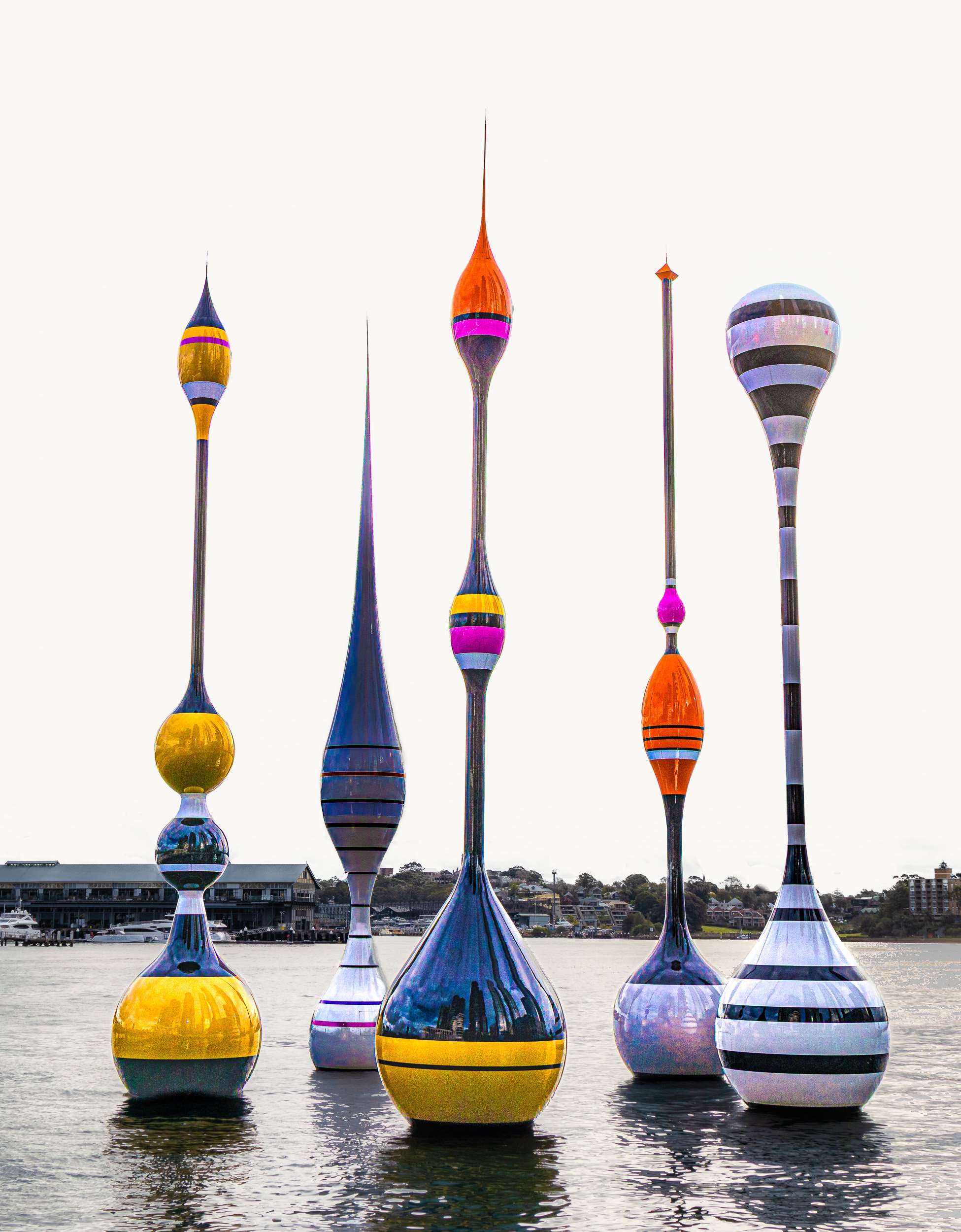
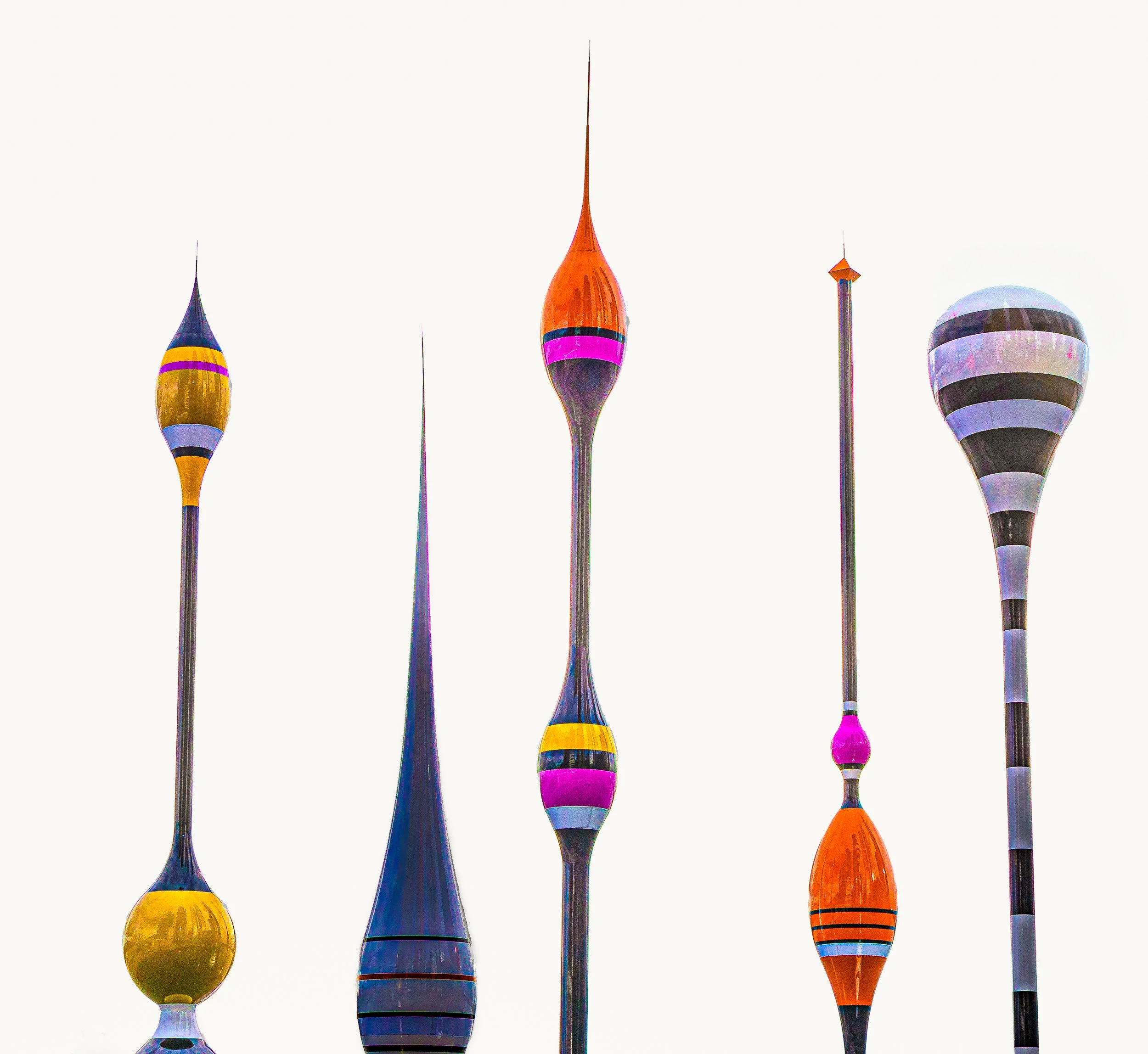
Barangaroo also features a group of new bobbing shapes: a permanent public art installation called Monuments for Fishes by Australian artist Mikala Dwyer. I was immediately captivated by the floating shapes They reminded me of something between skittles and temple spires, but most of all I loved the colours. My vision for this image was to remove the distraction of the rather uninteresting sky and leave behind a stark, almost white stage for the shapes to shine against. I pushed the colours further in post-production, and particularly loved bringing out the bold magentas, oranges and yellows.
The tighter crops worked beautifully too. Once the water and surrounding land disappeared, the images became almost entirely about colour, shape and line.
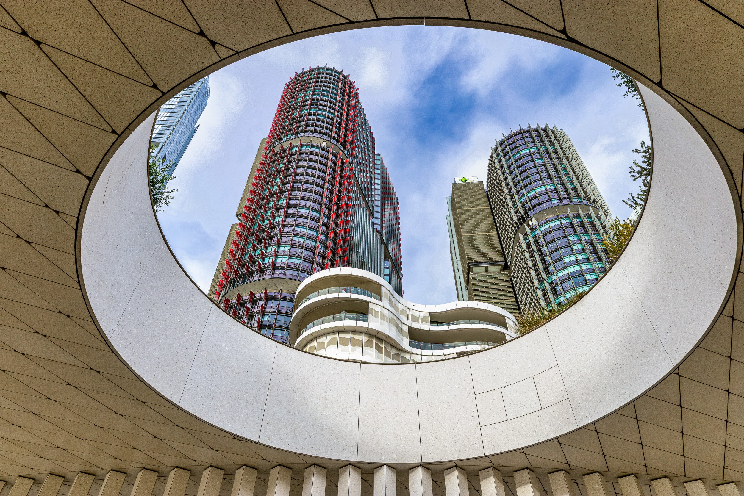
My favourite location of the day was beneath a structure with a large circular cut-out. Such a simple shape , but it created the most wonderful peephole framing the towering buildings above. I particularly loved the red building and was very happy to showcase it through that beautiful circular opening. I’ve always loved a frame within a frame, but a circular frame within a frame is an absolute winner.
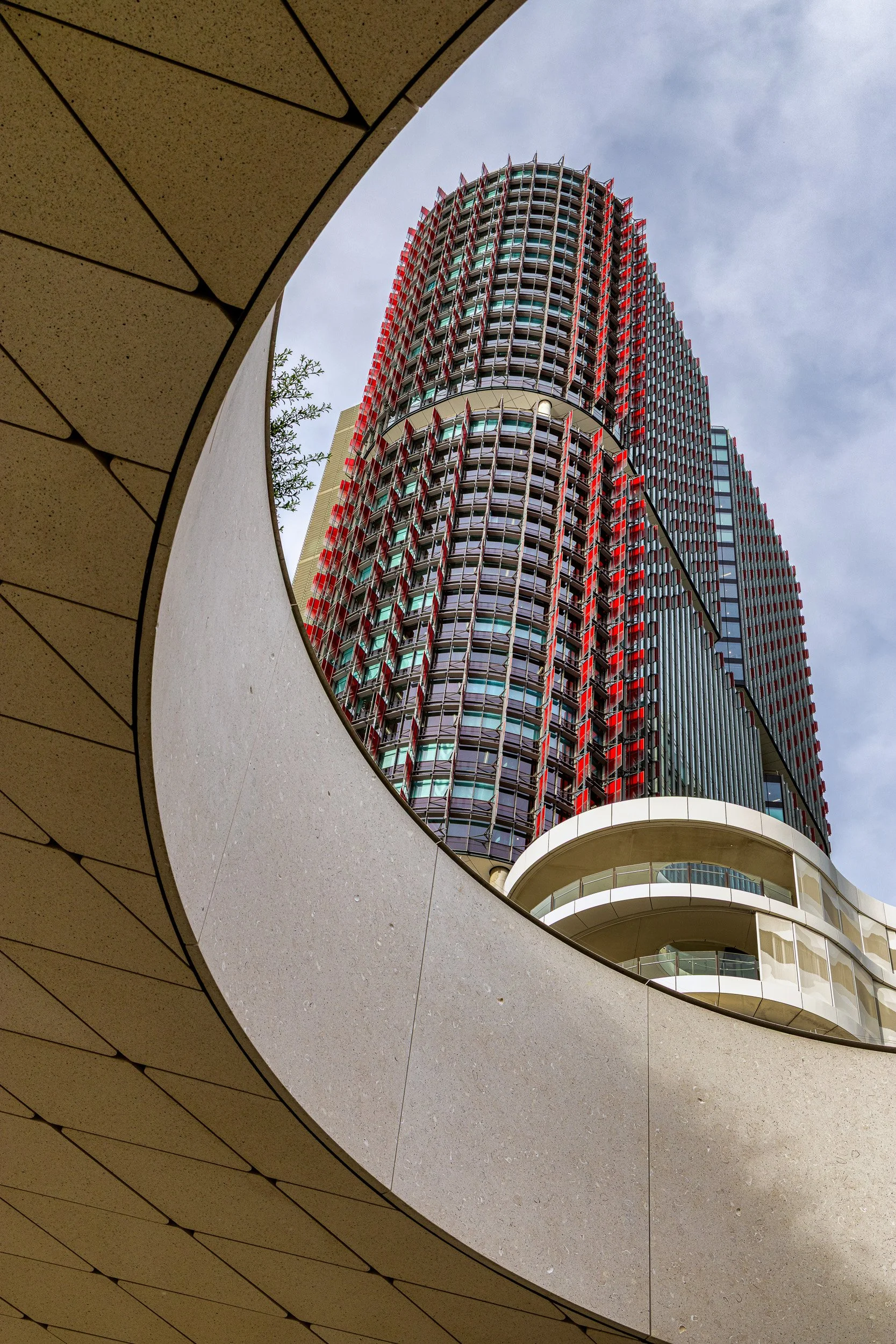
Sometimes the most interesting photographs come from simply looking up, looking through, and finding shapes within shapes.
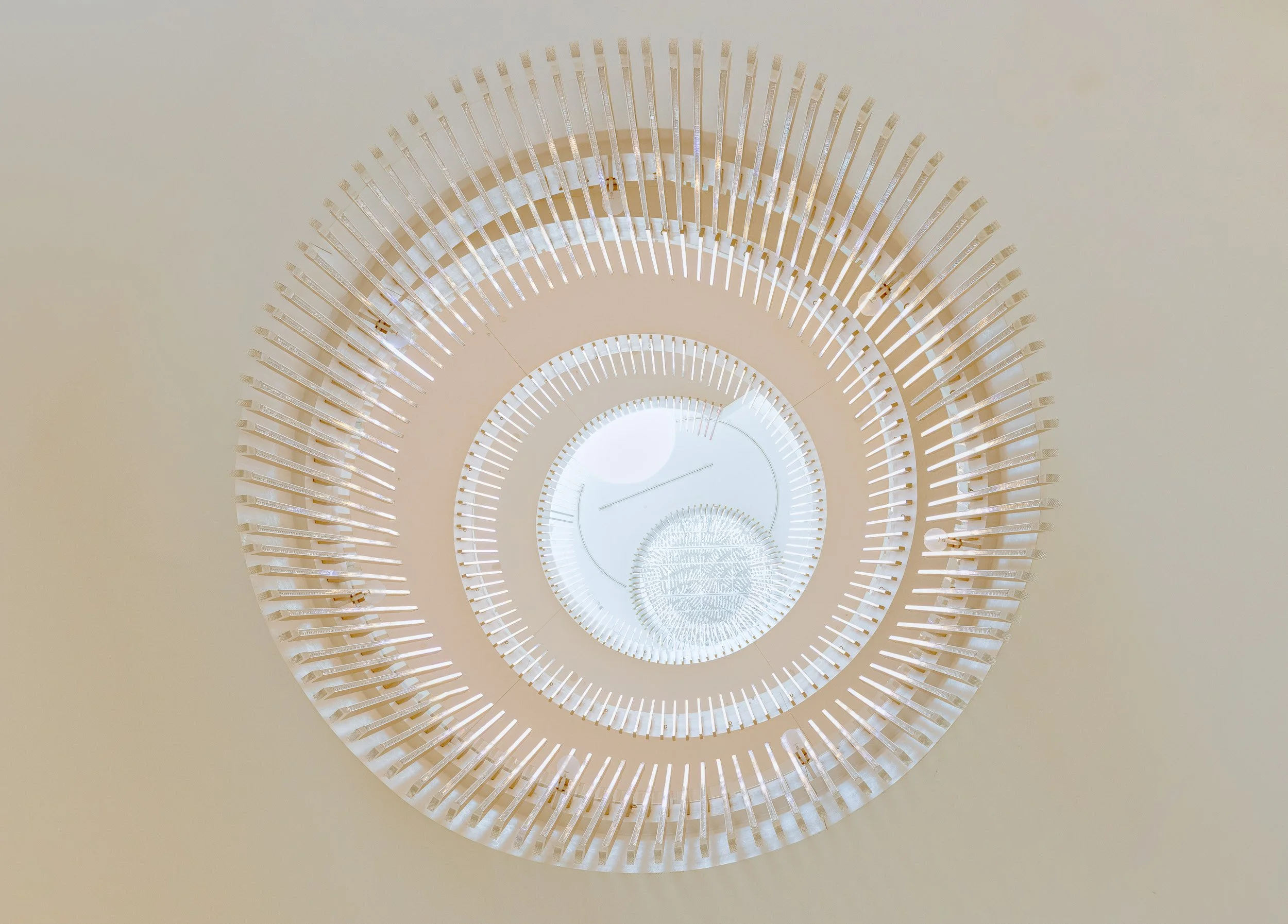
‘Looking up, down and all around’ in the Crown Casino was a must. The interior is sleek and opulent, with sweeping white-and-gold staircases, sculptural lighting and polished surfaces everywhere you turn. As spectacular as those gold-and-white features looked in person, once downloaded onto my computer they looked downright awful. They posed what we might politely call an ‘editing challenge’.
After many, many changes, adjustments and false starts, I finally arrived at an image of the staircase and lights that captured something of what had originally caught my eye — and, most importantly, ones I was finally pleased with.
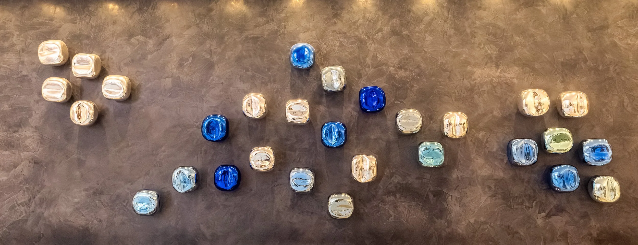
These blue-and-gold pebbles, set against the textured dark wall, were one of those details at Crown that I could easily imagine having in my own home — and absolutely loving.
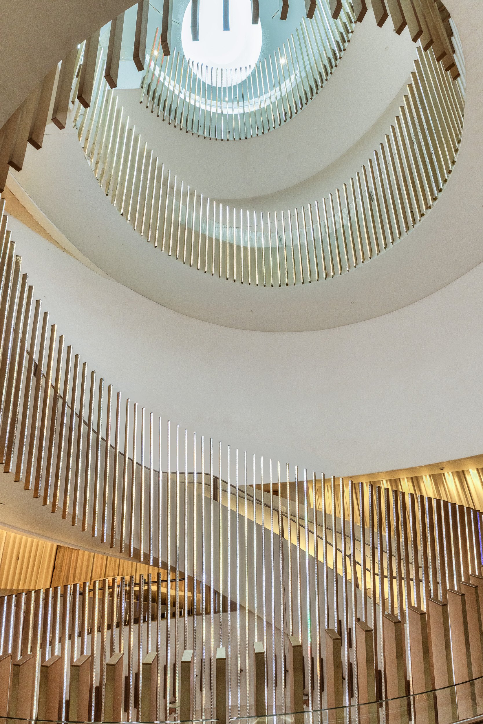
Editing nightmare number 2, now a beautiful staircase again.
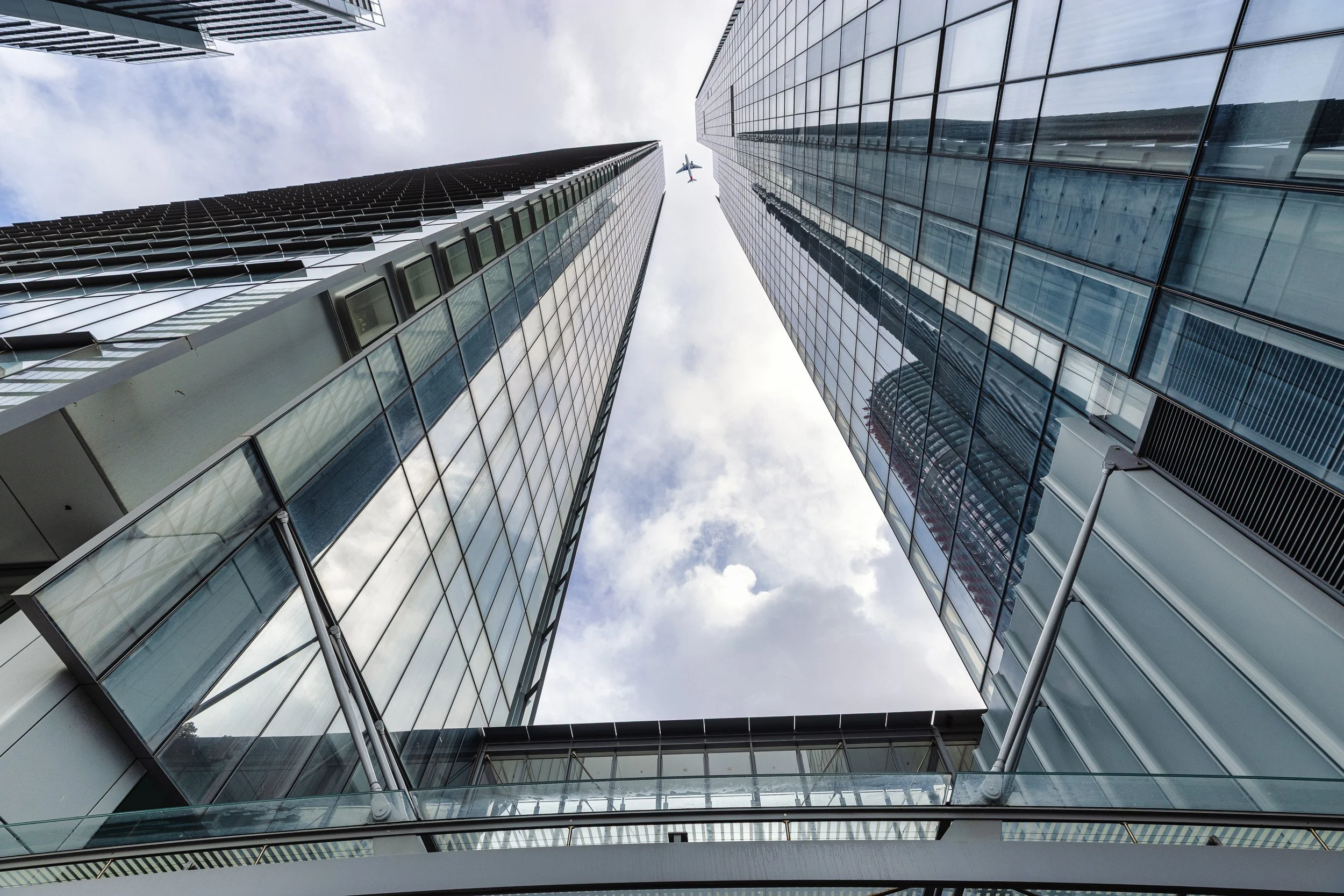
While looking straight up at another group of towers, just outside the Crown, I kept thinking how much better the composition would look if an aeroplane happened to fly through exactly the right part of the frame. Of course, no plane appeared — so I added one in post. I think it adds scale and a little bit of fun to the image, and I like it a lot.
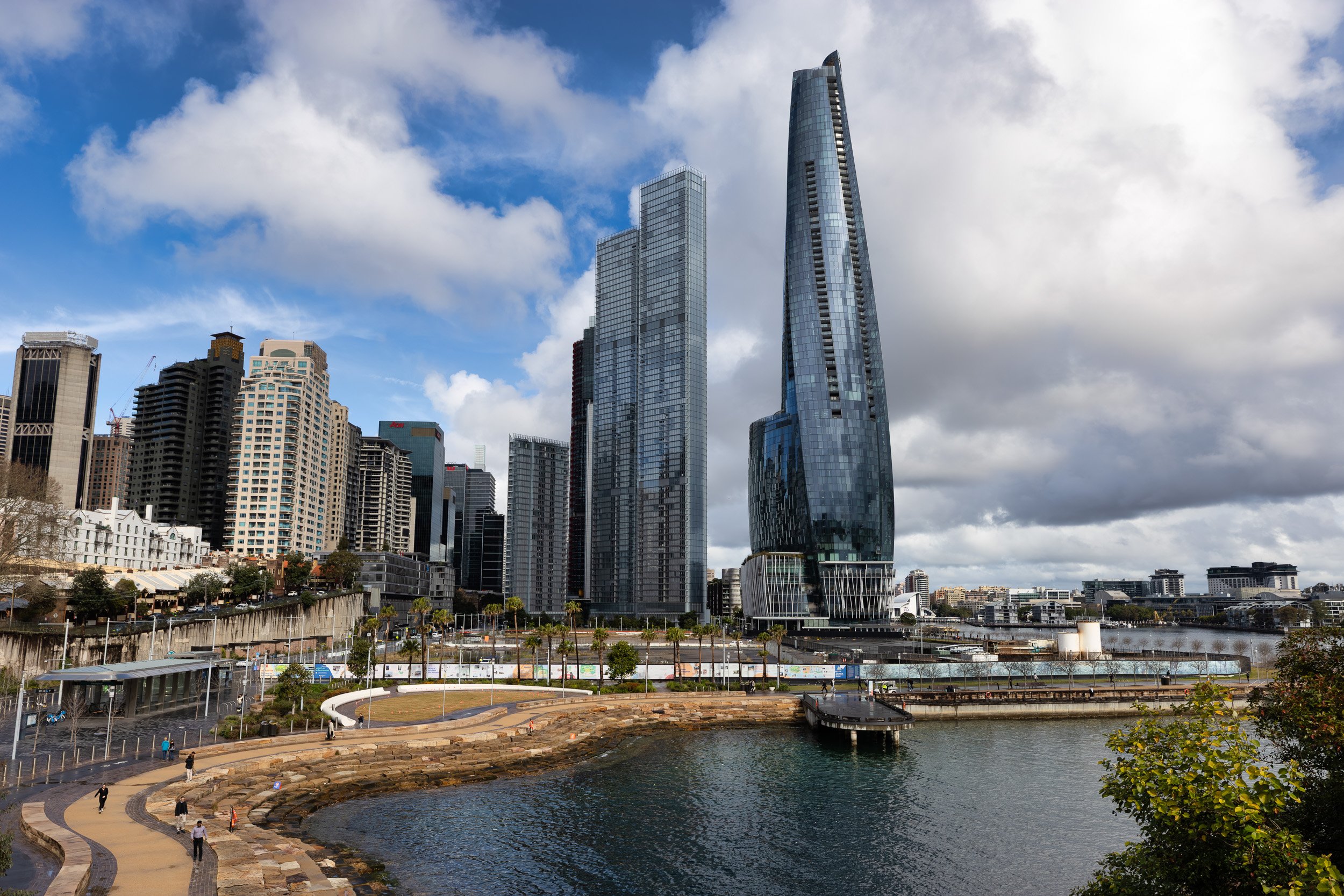
The broader Barangaroo landscape is also a delight to photograph. It is hard not to enjoy the distinctive shapes of the towers, particularly when the very upright, stark architecture is juxtaposed against the beautifully curved and flowing shoreline and pathways below. The contrast between those hard vertical structures and the softer landscape makes the whole area visually fascinating.
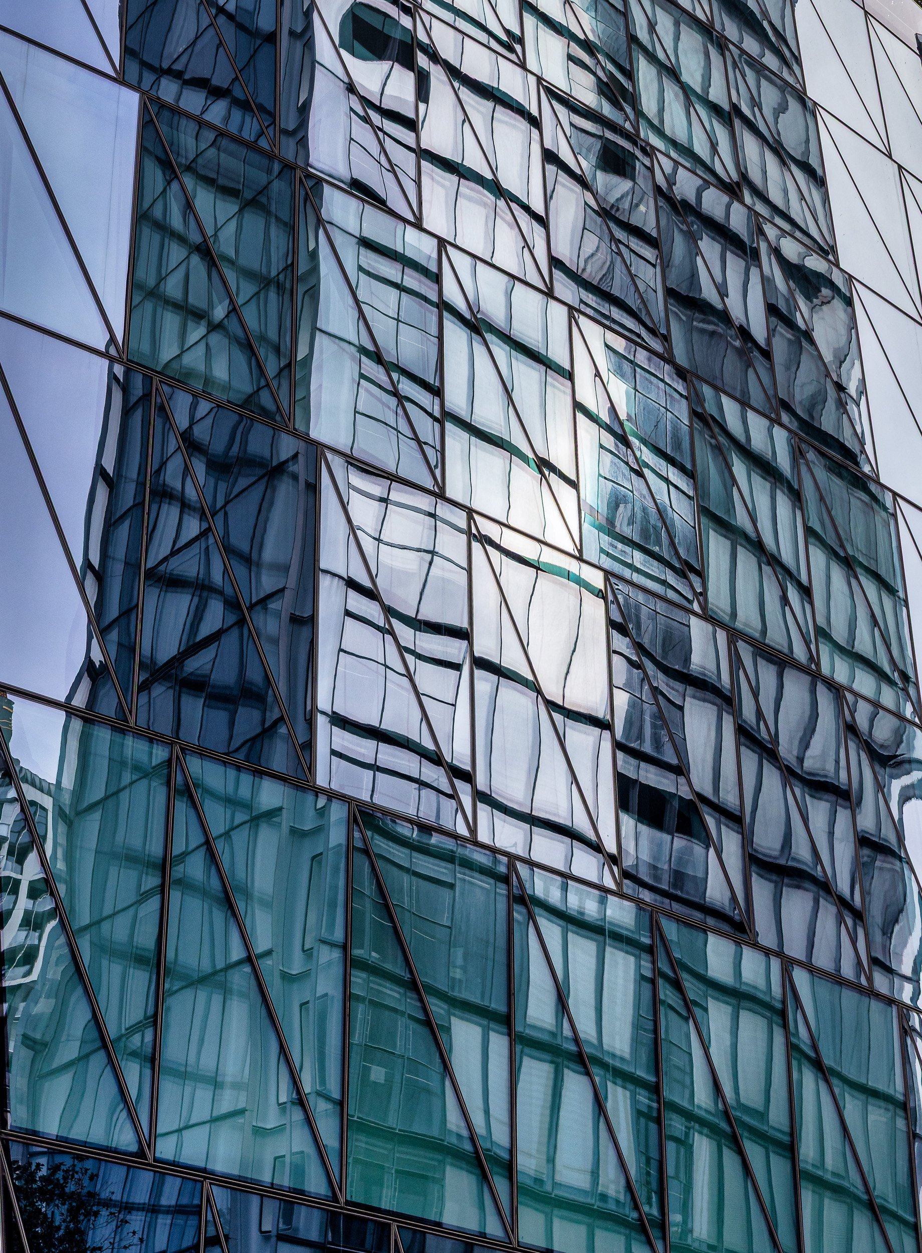
Look at the incredible layers in this building façade. A beautifully shaped window can also reflect the buildings around it, and what might otherwise be just a plain pane of glass suddenly becomes full of texture, pattern and unexpected detail. It is a joy of colour, shape and reflection — and, of course, a healthy scoop of wonky.
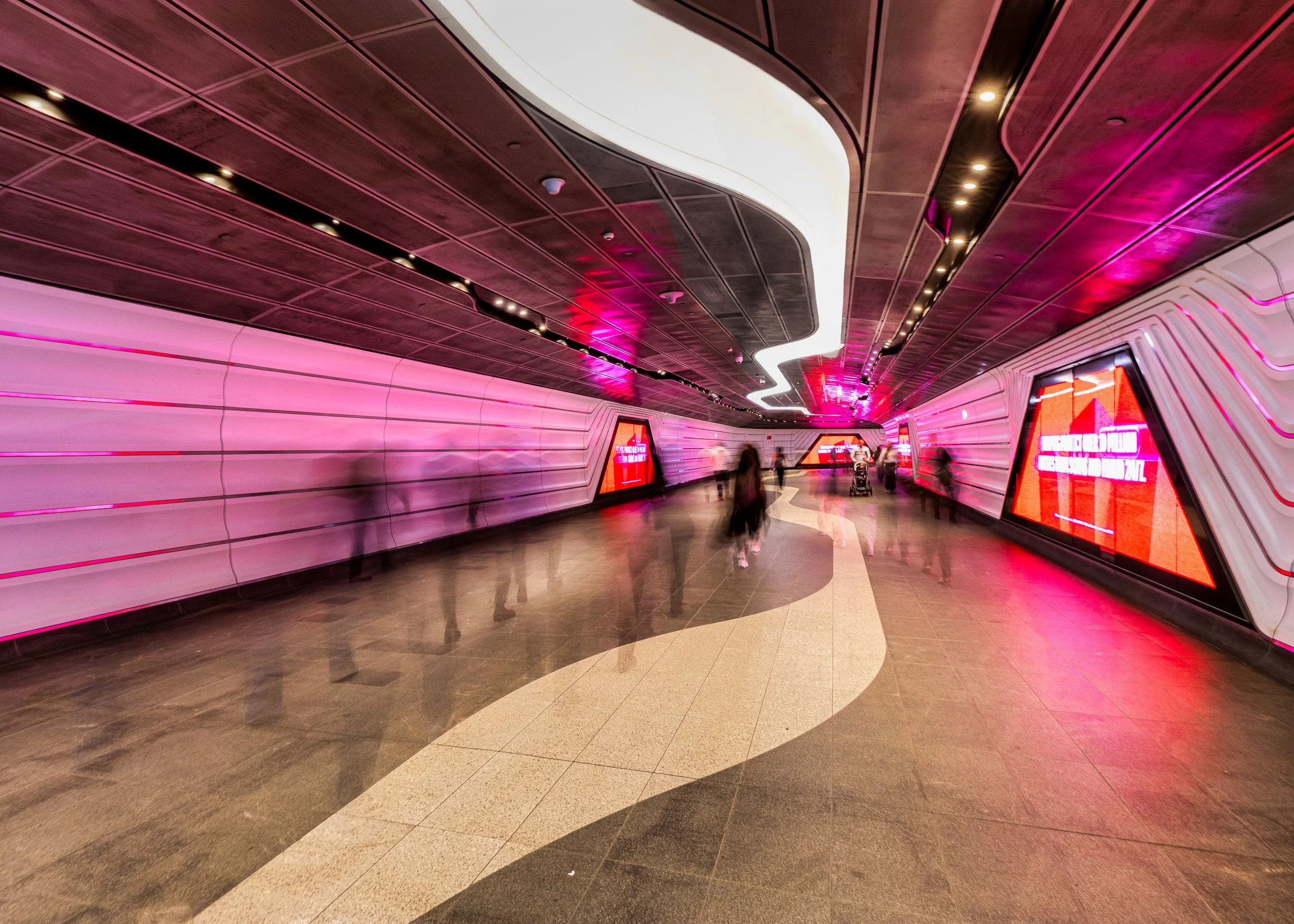
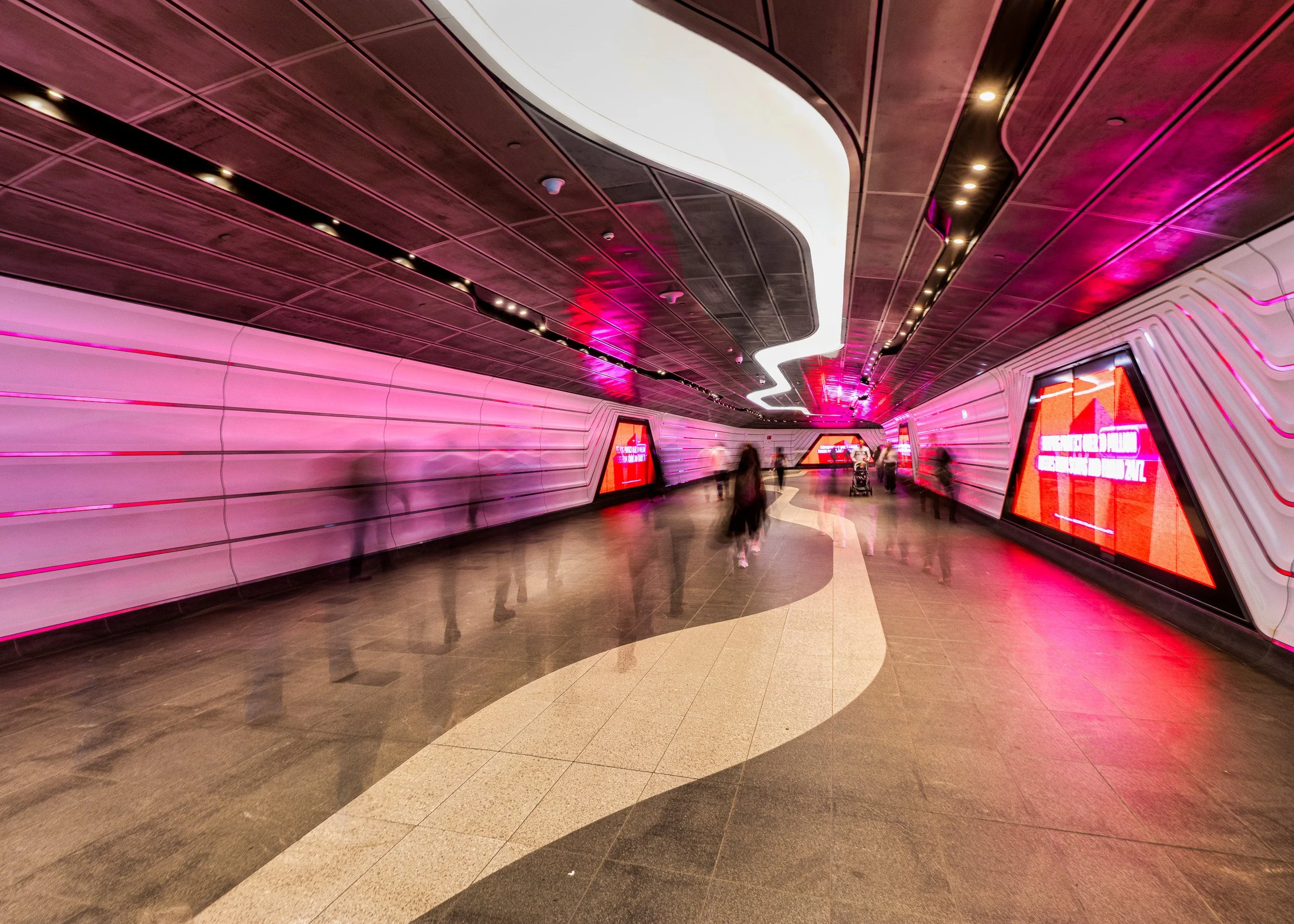
Another favourite image from the day came from the Wynyard Walk. I used a half-second exposure so the people moving through the corridor became ghostly blurs, creating a sense of energy and constant movement. The lighting in the walkway changed colour, and the moment it turned red I started shooting.
In post-production I wanted to push the magenta and red neon colours and make the whole scene feel slightly otherworldly. The glowing ceiling lines, blurred figures and sweeping shapes made it feel almost futuristic — very different from the quieter architectural images from earlier in the day, but great fun to work with.
The more architectural photography I do, the more I realise that I’m not necessarily looking for perfect buildings or perfectly straight lines. Sometimes I want symmetry and precision. Other times I want reflections, distortion, strange angles, colour, movement — and, apparently, a healthy dose of wonkiness.
Perhaps that is the biggest lesson from these architecture walks with Kathy: there is no shortage of interesting photographs. You just have to learn how to see them and sometimes the difference between an ordinary shot and a brilliant one is, ‘just a step to the right’.
Thank you Kathy Wallace again for such a wonderful afternoon. I could not recommend you more highly to anyone wanting an architectural photographic experience in Sydney.
